Published by the Andrew Thrasher Technical Analysis Blog on 1/10/2013. I agree with everything Andrew says here, but it also needs to be said that the S&P is in a solid uptrend right now, and if it breaks out above 1475, it could move up another 100 points very quickly.
 As the blue dotted lines each show, momentum (based on the RSI and TSI) and breath (McClellan Osc.) are all, to some degree, diverging from the price of the S&P 500. We saw a similar instance back in March before the market peaked and dropped nearly 150 S&P points.
I don’t mean to beat the drum of the bears over and over again but it just seems like there is no one talking about this. It seems everyone refuses to take off their rose-colored glasses and is ignoring what’s going on in the capital markets. Traders have taken their margin accounts to the highest level since before the financial crisis. The last time NYSE margin debt was higher than it right now was February 2008. Wall Street analysts have, in almost near-unison announced that2013 will be a year of strong equity performance. When everyone is holding the same consensus history has shown us that more times than not, they are wrong. The $VIX yesterday hit a level that we hadn’t seen since 2007. Yes I know that volatility can stay low and even go lower as we saw in late 2006 and 2007, but does the current market and economic landscape look similar to pre-financial crisis times? I don’t think so either.
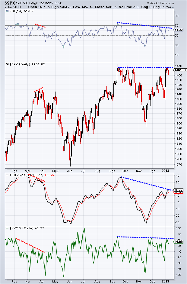
Last Friday I looked at the longer term picture of the S&P 500. One of the charts I showed was of the lowers highs in the Relative Strength Index on a month basis. Today I want to zoom in a bit and look at the daily chart of the S&P and specifically focus on three different indicators.
Before I get into it, let me first say… I could be completely wrong. My bearishness could be incorrect and we could sail higher by another 25%. What’s important is that I’m 1000% okay with that. I don’t marry my analysis and I am constantly looking for ways I could be wrong.
First we have the Relative Strength Index, which examines the size of recent gains to recent losses. The indicator will drop as losses begin to outweigh the gains, signaling that advancing momentum is weakening. Next up we have theTrue Strength Index. TSI essentially looks at the a smoothed version of rate of change. By applying a moving average to a moving average of the rate of change we can get rid of some of the market noise, giving us a cleaner picture of momentum. Finally, we have the well-known McClellan Oscillator, which looks the breath of a rally or decline by taking into account the number of advancing and declining stocks within an index, in this case – the NYSE.
As the blue dotted lines each show, momentum (based on the RSI and TSI) and breath (McClellan Osc.) are all, to some degree, diverging from the price of the S&P 500. We saw a similar instance back in March before the market peaked and dropped nearly 150 S&P points.
This type of divergence can play out three different ways: 1. price corrects and confirms what we are seeing in the other three indicators, 2. time passes and we see a type of consolation which allows the divergences to work themselves out, and 3. price ignores market momentum and breath divergences and continues its advance. I can’t tell you which one of these will happen, but the coming weeks will show us.
I’ve been fairly negative about equities since last week. It’s important to note that I’m not 100% sold we drop like a rock tomorrow or the next day. I’m still seeing bullish buying pressure taking place, which is likely what’s kept things afloat over the past few trading sessions. I wouldn’t be overly surprised if we advance further, possibility taking out the previous high. I’ll be keeping a close eye on how momentum shapes out going forward and if volume begins to confirm what I’m seeing take place in momentum and breath.
No comments:
Post a Comment