Total Pageviews

Wednesday, July 31, 2013

13 Year Cycle IS Saying Something

Posted by JC Parets on July 30th, 2013

As you guys know, I take a look at a lot of charts every day. I mean, I literally look at thousands of charts daily. But this one from Chris Kimble takes the cake as the best chart I’ve seen all week. And by best I mean the most interesting, not necessarily the most bullish.

The first thing you notice is the 13 year cycle of major tops and bottoms that have been put in for the Dow Jones Industrial Average going back to 1974. Currently we’re in the 13th year after a major top was put in during the year 2000. So cyclically, the market is vulnerable according to this chart:

Click chart to embiggen
7-30-13 dow chris kimble

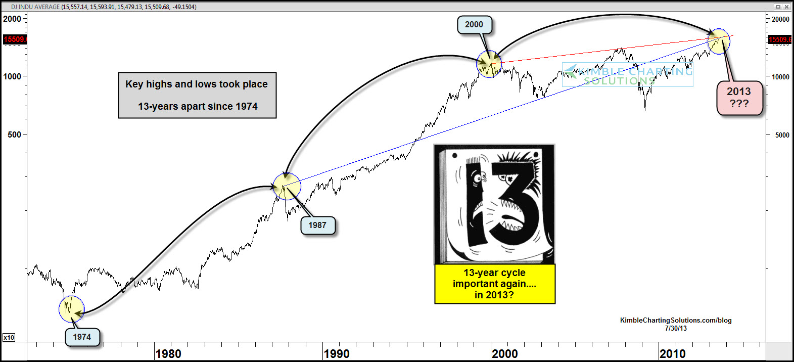
But the two trendlines that go back to the 1987 and 2000 tops are just fascinating.

Make what you will of this chart. Call it a coincidence if you want. But tell me this isn’t the chart of the day?

http://allstarcharts.com/chart-of-the-day-dow-cycles/

Monday, July 29, 2013

Approaching Resistance

The equity market has surpassed its 2007 peak already and the bullish cheerleaders are just jumping up and down for new record highs. However, there is one relationship that has yet to breakout – the S&P 500 and 10-year Treasury ratio. There is a falling trend line from the 2000 high to the 2007 high that we are slowly approaching.

Below is a monthly chart of the S&P 500 ($SPX) vs. the 10-year Treasury Note ($UST), this is comparing the price action of stocks vs. bonds (not bond yields!) going back to 2000. The falling trend line has yet to be tested and while we can speculate its importance, until we get there we can’t know. If things continue to shape out as they have been for the last couple of months with equities kicking the tail off of bonds then we will find out sooner rather than later what the reaction will be to this resistance and its implications for the capital markets. Until then we patiently wait.


spx ust 

http://www.athrasher.com/the-relationship-between-stocks-and-bonds-approaches-resistance/

Orwell vs. Huxley

http://www.ritholtz.com/blog/wp-content/uploads/2011/11/rrxW1.png

Saturday, July 27, 2013

Coming To A City Near You

A year from now, two stark white aerostats will hover over Washington, D.C., a pair of eyes in the sky to detect incoming threats. After eight years in development, two early user tests, and $2.7 billion, JLENS, the abbreviated title (thankfully) of the Joint Land Attack Cruise Missile Defense Elevated Netted Sensor System, is ready for deployment. 

"We're transitioning from a development program to an actual program where the users are coming in and operating the system," JLENS program director Doug Burgess said during a press conference Wednesday morning. "[We're] getting away from the PhD engineer types running the system to the 20- or 25-year-old soldier running the system." 

Defense giant Raytheon designed JLENS as a cost-effective surveillance system that could keep watch for hostile targets such as terrain-hugging cruise missiles, ballistic missiles, swarming boats, and unmanned aircraft.PopMech covered the project last August before JLENS moved into its first wave of early user testing in the fall. Following six weeks of testing in May and June, one hundred U.S. Army soldiers have been trained on the JLENS system and will travel with the aerostat. . . .


Tuesday, July 23, 2013

Epic


Gold At Critical Area

After its historic breakdown in June, Gold has now rallied all the way back to levels that had served as support for several months. This has a lot of the Gold bulls all excited as we start the new week. But can we really trust this rally? Should we? I’m still not convinced.
On the first day of Technical Analysis kindergarten, we are taught the theory of polarity. This is the one where former support then turns into resistance and vice versa. So when we look at this chart, should we ignore what we were taught on Day 1?
7-22-13 gc
I’ll say this: it’s certainly not a place where I would want to be buying. But shorting into this range is probably not the best idea either, at least not yet. To buy here is dangerous, in my opinion, because we’re running right into this former support. But we also have a downtrend line from the April highs. So there just seems to be too much overhead supply for my taste.
But to short here as the metal is ripping can be a tough trade as well. I’d at least let this thing try to break through and fail to have something to short against. This helps with the risk management. On the long side, if we do break this downtrend line, and do clear former support levels (both big IFs), then we’ll reevaluate and see if the long side of the Gold trade presents a favorable risk/reward.

But heading into the new week, there doesn’t seem to be anything to do here. At least not in the time frame we’re talking about in this post.

http://allstarcharts.com/gold-rallies-back-to-broken-support/

Saturday, July 13, 2013

Apple

After a vicious -45% decline from all-time highs, Apple (AAPL) looks as if it may finally be bottoming.

Things we like on the chart: (1) an apparent double bottom; (2) contracting volume at the April and June price lows; and (3) the positive divergence expressed by the rising PMO bottoms.
Screen shot 2013-07-12 at 10.05.05 AM
Things we don't like: (1) the price advance off the most recent low has been sluggish with no enthusiasm reflected in volume; and (2) the relative strength line in the bottom panel shows that the stock is still under-performing relative to the S&P 500 Index.
A brief review of fundamentals indicates that AAPL is undervalued, with a P/E of 10. And it is a good company with lots of cash that pays a dividend of 2.9%.
Conclusion: Apple has taken a beating during the last 10 months, but the technicals show that a bottom is currently forming. We can't say that this is THE bottom, but it is the most promising looking bottom since the decline began

Monday, July 8, 2013

Credibility Trap


Snowden


Euro and Pound Look To Rollover

ChartWatchers
July 06, 2013
Written by Richard Rhodes

This past week, the monetary policy world shook once again as the Bank of England and the European Central Bank provided the markets with "dovish" comments regarding leaving o/n funding rates low "for an extended period of time." This was clearly reminiscent of the Fed's proclamation some years ago; and served to buttress a move into risk assets. Whether or not this is the case this time is up for debate, and will be known in the fullness of time.

Euro 7-5-13

However, what we do believe to be true is that the British Pound Sterling and Euro are embarking upon declines that will carry them very sharply lower. In particular, our focus is upon the Euro chart, and the fact that a larger bearish consolidation was confirmed in February, with prices simply consolidating since then. But, the fact of the matter is that during this time, a right shoulder of a bearish "head & shoulders" top pattern has formed, of which neckline support is on the verge of being given. We believe the odds are rather good for such a decline given the 40-day stochastic is just now turning lower from less than overbought levels.

The downside target measurement is 1.2000...a full 8 "big figures" from current levels. However, let us forewarn our readers, a move to this level would cause significant long-term technical damage on the monthly chart (not shown). Quite simply, this would break the neckline of a 10-year "head & shoulders" top pattern, which would then target the 2001-2002 lows near .9000.

In any case, the bottom line is that it is proper to be sellers of Euros at current levels - now and into the future as both the fundamentals and technicals are lining up in proper order.