Thursday, February 28, 2013
Absolutely Shocking!!! We Are Living In Police State
STAND UP FOR YOUR RIGHTS WHILE WE HAVE THEM AND DO NOT GIVE INTO INTIMIDATION....WE ARE LIVING IN TERRIFYING TIMES AND WE MUST BE STRONG!

Wednesday, February 27, 2013


Dr. Copper Might Being Needing a Doctor
With the recent sell-offs in US Markets, let’s keep in mind that some other areas of the world have been doing just that for over a month now. It started with Europe and some of the emerging markets the day after the Super Bowl. And since then, some of the economically sensitive commodities have joined in. Most importantly, in my opinion, is what we’re seeing from Copper – one of my favorite tells out there.
Here is a weekly chart of Copper Futures. The highs in the chart came back in February of 2011, just a couple of months before US Stocks peaked and lost over 20% over the next two quarters. Copper continued its decline along with Stocks and they both bottomed out together that October.
Since then, US Stocks have gone on to hit higher highs, and even all-time highs in some cases like the Small-caps, Mid-caps and Dow Transports. Copper, on the other hand, has not. In fact, as you can see in this weekly bar chart, the base metal has actually been stuck within this smaller symmetrical triangle that developed towards the bottom end of a much larger consolidation.
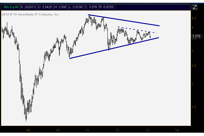
I think Copper here is a good tell here. We’ve been seeing some weakness unfold, no question, but this one could either foreshadow a more precipitous decline in risk assets, or hang on to that key multi-year trendline support and offer more of a “stay long” signal.
The bad news here is that Copper is currently attempting to hold on to this uptrend line from the June 2010 lows for what is now the 6th time. Unfortunately, the more times that a level is tested, the higher the likelihood that it breaks.
We can’t forget about this one – Dr. Copper knows.
Tuesday, February 26, 2013

Monday, February 25, 2013
Broadening Top = Market Top
Posted by JC Parets to All Star Charts on February 25, 2013.
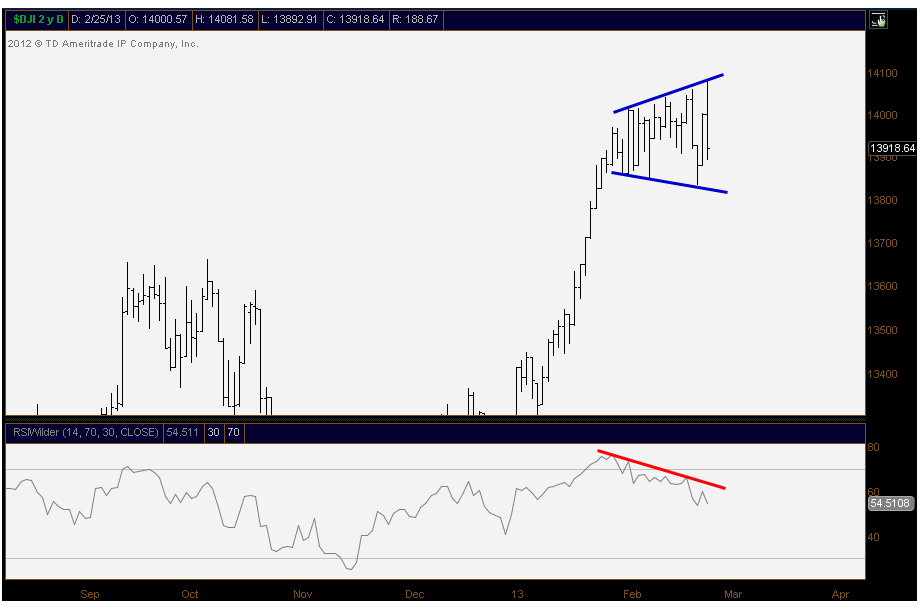
So here is a quick snapshot of the Dow Jones Industrial Average and its broadening top formation. This one has been forming since the end of January and I think it’s pretty clear. Consider this one another feather in the hat for the bears.
This particular type of formation is fascinating to me because it frustrates everyone. Here’s the psychology behind it: Take the lows from back in early February and you have the bulls saying,“okay, we’re long and strong, unless we take out last week’s lows. If we roll over, we’ll get out”. Then the lows get taken out just before reversing higher to make fresh highs. Those disciplined longs are now out of this market and watching it rip without them.
Then towards the top of the range, you have the bears saying, “okay, we’re short right here and we’ll cover if we make new highs”. Then, of course, the market makes new highs, taking out the stops and then reverses lower to make fresh lows. The bears are now watching the market get crushed without them.
At this point, the bulls are frustrated. The bears are frustrated. And everyone who did nothing is still a genius. Then the same thing happens again with the longs against the new pivot lows. And the same thing happens again with the shorts against recent pivot highs.
It’s a ridiculous cycle that is definitely amusing to watch. But at the end of the day, the increase in volatility is a sign of a turning point. And therefore, since we’ve rallied into this particular broadening formation, a reversal here would signal lower prices for the Dow Industrials.
I’d say a breakdown below last week’s lows would confirm, but then I would just be another silly trader that we just had some fun with up above.
*One more thing to note is the bearish divergence in RSI down at the bottom of the chart. Fresh highs Monday morning for the Dow Jones Industrial Average (imagine that), but lower highs clearly in the Relative Strength Index.
Careful out there…

Sunday, February 24, 2013
Cyclical Low Likely In Gold
Written by David A. Banister, Market Trend Forecast, undated.
Over the past 5 calendar years we have seen GOLD either complete an intermediate cyclical top or bottom in each February. My forecast was for February of 2013 to be no different and for Gold and Silver to make trough lows this month. With that said, I did not expect the drop in GOLD to go much below $1,620 per ounce at worst, but in fact it has. Where does that leave us now on the technical patterns and crowd behavioral views?
First let’s examine the last 5 years and you can see how I noted tops and bottoms in the chart below:

That brings us forward to todays $1,573 spot pricing and trying to determine where the next move will go. To help with that end, some of our work centers on Elliott Wave Theory, along with fundamentals and traditional technical patterns of course. In this case, the recent action around Gold has been very difficult to ascertain, and I will be the first to admit as much. With that said, one pattern we can surmise is a rare pattern Elliott termed the “Double Three” pattern. Essentially you have two ABC type moves, and in the middle what is dubbed an “X” wave, which breaks up the ABC’s on each end of the pattern. For sure, if we add in traditional technical indicators along with sentiment, we can see very oversold levels coupled with the potential Double Three pattern and probably start getting long here for a trade back to the 1650’s as possible:

Obviously this chart shows oversold readings in the lower right corner using the CCI indicator. That said we would like to see 1550 hold on a weekly closing basis to remain optimistic for a strong rebound.
Bullish Divergence
Article published by YCharts on Feb. 22, 2013. After the article, I am adding a weekly chart of GDX, the gold mining etf, whose momentum indicators are exhibiting strong bullish divergences. These long-term bullish divergence situations often work out very well, if you patiently wait for price to turn around before getting long. The one I pointed out on HPQlast fall is now bearing fruit.


The Wall Street Journal reported that money managers are widely shorting gold, at a time when there seems little risk of inflation, which of course is the friend of gold prices.
Gold, despite inflation remaining very tame, has smoked competing investments over the past decade, even gold-lampooner Warren Buffett’s company, Berkshire Hathaway. But, as Buffett has written, the thing most propelling gold has been gold bugs’ belief that it would go up, rather than any intrinsic value.
Gold mining stocks – Barrick Gold (ABX), Newmont Mining (NEM), GoldCorp (GG), Kinross Gold (KGC), Gold Fields (GFI) and Novagold (NG) – have fallen harder than gold itself in recent months.
Gold Price in US Dollars data by YCharts
Saturday, February 23, 2013
Dare We Be Brave and Speak Up and Face The Consequences?
please check the whole story from http://jessescrossroadscafe.blogspot.com/2013/02/on-anniversary-of-death-of-sophie.html

Friday, February 22, 2013

The Time To Act Is Now
Guest Post from Chris Vermeulen at TheGoldandOilGuy.com
Gold and silver along with their related miners have been under a lot of selling pressure the last few months. Prices have fallen far enough to make most traders and investors start to panic and close out their long term positions which is a bullish signal in my opinion.
My trading tactic for both swing trading and day trading thrive on entering and exiting positions when panic trading hits an investment. General rule of thumb is to buy when others are extremely fearful and cannot hold on to a losing position any longer. When they are selling I am usually slowly accumulating a long position.
Looking at the charts below of gold and silver you can see the strong selling over the past two weeks.When you get drops this sharp investors tend to focus on their account statements watching the value drop at an accelerated rate to the point where they ignore the charts and just liquidate everything they have to preserve their capital.
Gold Bullion Weekly Chart:
The price and outlook of gold has not really changed much in the past year. It remains in a major bullmarket and has been taking a breather, nothing more. Stepping back and reviewing the weekly chart it’sclear that gold is nearing long term support. With panic selling hitting the gold market and long termsupport only $20 – $30 dollars away this investment starts to look really tasty.
But if price breaks below the $1540 level and closed down there on a weekly basis then all bets are off as this would trigger a wave of selling that would make the recent selling look insignificant. And theuptrend in gold would now be over.

Silver Bullion Weekly Chart:
Silver price is in the same boat as its big sister (Yellow Gold). Only difference is that silver has larger price swings of 2-3x more than gold. This is what attracts more traders and investors but unfortunately the masses do not know how to manage leveraged investments like this and end up losing their shirts.
A breakdown below the $26.11 price would likely trigger a sharp drop back down to the $17.50 level so be careful…

Gold Mining Stocks – Monthly Chart:
If you wanna see a scary chart then look at what could happen or is happening to gold miner stocks. This very could be happening as we speak and why I have been pounding the table for months no to get long gold, silver or miners until we see complete panic selling or a bullish basing pattern form on the charts. We have not seen either of these things take place although panic selling is slowly ramping up this week.
There will be some very frustrated gold bugs if they take another 33% hair cut in value…

Precious Metals Trend and Trading Conclusion:In short, the precious metal sector remains in a cyclical bull market. That being said and looking at the daily charts the prices have been consolidating and are in a down trend currently. Until we see some type of bottoming pattern or price action form it is best to sit on the side lines and watch the emotional traders get caught up and do the wrong thing.
The next two weeks will be crucial for gold, silver and miner stocks. If metals cannot find support and close below the key support levels things could get really ugly fast.
Thursday, February 21, 2013

Dual Sell Signals
Interesting, and he may be right, but he could also be jumping the gun. Drawing trendlines is highly subjective. In this case, another valid trendline, but less steep, could be drawn, and it has not been violated yet. In my experience the most reliable thing for predicting directional price movement is directional price movement itself, and so far we have only had a taste of that. Published by The Right Side of the Chart on February 20, 2013.
I’ve recently discussed two of my most reliable longer-term sell signals: The AAII Bull/Bear Spread Extremes as well as the $NAAD simple trendline buy/sell indicator (click on either to see the previous charts and discussion). In the last update to the $NAAD indicator about a week ago, I pointed out that a sell signal was likely to be triggered soon, which it has as shown in the updated chart below.
Regarding the pending AAII Bull/Bear Spread signal, we were waiting for the Bull/Bear Spread to moderate back below the 18%+ extreme level for at least two consecutive weeks, which as the chart below shows, happened last week with a spread of 13.52% vs. following a spread of 13.21% the previous week, both well below the 18%+ extreme level that has historically preceded significant stock market corrections. AAII is scheduled to release the most recent survey results tomorrow which will most likely fall below an 18 point spread once again but regardless, the signal has already been officially triggered.
Once again, the previous charts and discussion on these signals can be view by clicking on the blue hyper-links in the first paragraph above. Remember, there isn’t a single indicator or buy/sell signal with a 100% accuracy rate, not even close. However, the track record on each of these two for catching significant trend reversals is about as good as they come as a stand alone system. The fact that they have both recently triggered a new & relatively infrequent sell signal should, at the very least, be a caution sign to those investors or traders who are positioned heavily long or considering accumulating new long positions at this point.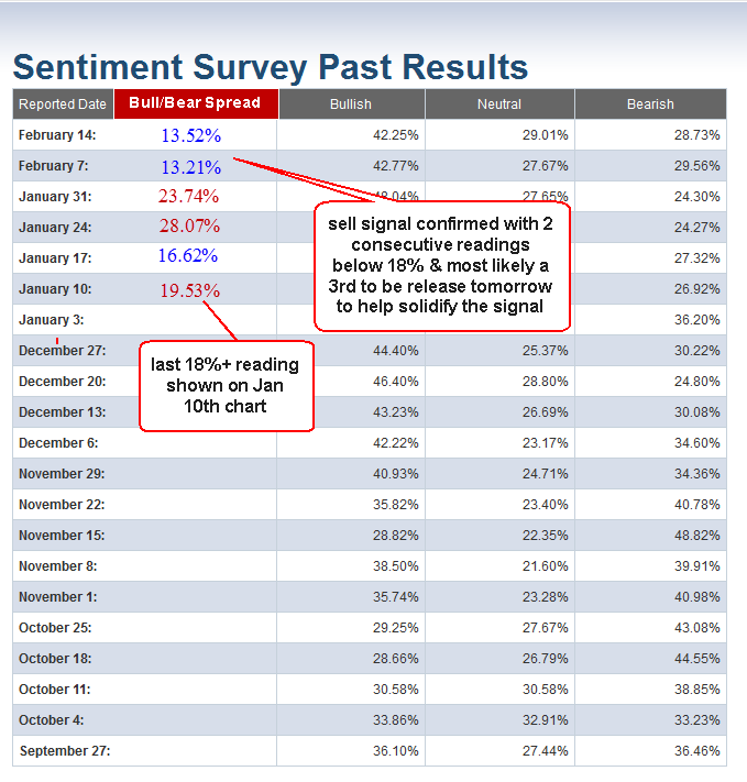
Wednesday, February 20, 2013
What Happens After The Winning Streak?
By Christopher Mistal, Stock Trader's Almanac, Feb. 19, 2013.
Although the S&P 500 ended last end with a minuscule 0.1% loss on Friday, its weekly performance was sufficient to extend its weekly winning streak to seven consecutive weeks. Including the current streak, the S&P 500 has accomplished this feat just 28 times since 1950 and 36 times since 1930. Prior to now, the last occurrence ended in January of 2011. In that year, the S&P 500 also began the year with a near vertical trajectory that lasted until the day before Presidents’ Day (6.8% year-to-date gain).
On the day after Presidents’ Day, the S&P 500 began a three-and-half week pullback that eventually erased all of its yearly gains before bottoming in mid-March. Today’s solid performance has eliminated the possibility of this year following the same course, but the week after February options expiration still has a bearish history with declines in 11 of the last 16 years and all streaks eventually end.
In the chart below, the previous 27 weekly winning streaks of 7 or more weeks have been plotted to show the S&P’s performance the over the 30 trading days before and the 60 trading days after the streak ended. On average, when the streak ends, gains resume, but the pace slows significantly.
Tuesday, February 19, 2013
Life Sucks

Days like these really suck ass....totally unexpected and totally depressing....My mom had a sudden stroke today....from a blood clot...prognosis is good...the clot allowed some blood through so nothing is permanent...if you all don't mind I ask for you to put her in your prayers this evening....
Chart Mania!!!!!!!!!!!!!!!!!!
Written by Cam Hui, Humble Student of the Markets, Feb. 19, 2013. Also known as the K-ratio, the $HUI:$GOLD ratio has historically indicated that gold mining stocks have become cheap relative to gold when the ratio is below .25, and bullion has become cheap relative to mining stocks when the ratio is above .55. Since the ratio is currently .235, gold mining stocks do look pretty cheap relative to the metal.
Last week, I wrote that traders looking for a correction should closely monitor the behavior of cyclical stocks (see Correction? Watch the cyclicals!). So far, cyclical stocks remain in a relative uptrend when compared to the market and their relative uptrend remains intact. There is no hint that a correction has begun.

What I do find unusual is that while the relative performance of cyclical stocks remain robust, the shares of commodity producers continue to lag. This is curious when resource stocks represent the most cyclically sensitive sectors of the stock market.
In addition, the price of gold is deflating despite the talk of currency wars. Gold is an alternate currency and should be a beneficiary under a scenario where global central banks engage in competitive devaluation. However, the price of gold is fallen so much that a dark cross, or death cross, is rapidly approaching.

Commodity producers washed out
In the past few months, gold stock investors have fared worse than holders of bullion. I have been a long advocate that gold bulls should hold bullion rather than the shares (see Where is the leverage to gold? as one of many examples of previous posts on this topic). However, we may be approaching a point where traders could tactically favor gold stocks over bullion.
The graph below show the ratio of the Amex Gold Bugs Index (HUI) against the price of gold charted on a weekly basis. I have further overlaid a 14-week RSI on the top panel. Note that weekly RSI is now below 30 indicating an oversold reading. Past oversold readings have marked points where gold stocks have outperformed gold. In addition, the HUI/gold ratio is nearing the bottom of 2008, when investors dumped gold stocks in a bout of panic selling.

An analysis of the relative performance mining stocks show a similar pattern. Mining stocks are also approaching a key relative support level marked by the 2008 panic bottom.

These charts suggest to me that mining stocks are getting washed out and they are poised for a reversal in the months ahead.
Within the resource and commodity producing sector, energy stocks show a more constructive relative performance pattern. The chart below of the relative performance of this sector indicate that energy stocks have rallied through a relative downtrend line, i.e. they've stopped underperforming and a reversal may be close at hand.

Based on this analysis, my inner investor tells me that it is time to start accumulating positions in energy and mining. My inner trader, on the other hand, wants to dip his toe in the energy sector, play the golds for a bounce and wait for the relative reversal in mining before committing funds.
Monday, February 18, 2013

Sunday, February 17, 2013


Air Pocket Ahead
Written by Tom Bowley for Chart Watchers on February 16, 2013.


I remain bullish for 2013 and believe we could see 1700-1800 on the S&P 500 before the year is over. But I can't deny the short-term warning signs that are showing up everywhere. Let's take the issues one at a time.
1. Historical Tailwinds Have Ended
Since 1950, the months of November, December and January have been the three best consecutive months for the S&P 500 and have accounted for roughly 50% of all of this benchmark index's gains during this period. That period just ended. Unfortunately, February has carried an annualized return of -1.27% over the past 63 years on the S&P 500, making it the 2nd worst calendar month of the year. Making matters worse, February has an annualized return of 5.02% from the 1st through the 15th, but has an annualized return of -11.47% in February AFTER the 15th. Friday was February 15th.
2. Momentum Has Slowed
We only have long-term momentum issues on a few indices that include biotechs and homebuilders. But shorter-term negative divergences are popping up everywhere. On Friday, I ran a StockCharts scan of POSITIVE divergence candidates and there were 30. I then ran a scan looking for potential NEGATIVE divergences and my scan returned nearly 200. Obviously, momentum is becoming an issue.
Over the past three months, financials (XLF) and industrials (XLI) have been the relative leaders with gains of 17.73% and 16.77%, respectively. But slowing momentum is already very obvious on both of these daily charts. Check them out:
The move higher has been great. 17% returns in 3 months - it's tough to beat that. Yet both of these leaders are looking like they need a rest. Higher prices with lower MACDs don't guarantee us that a correction is coming, at least not as far as I'm concerned. What they DO tell me, though, is that risks are elevated and that is what technical analysis is all about. Instead of shallow pullbacks to test rising 20 day EMAs, I'm beginning to think we're ready for 50 day SMA tests.
3. The Volatility Index ($VIX) Bottoming?
On Friday, the VIX not only tested the January low, signaling perhaps a double bottom, but it also printed a doji candlestick. Dojis are considered reversing candlesticks and it would make sense for the VIX to reverse at the current level. If it does reverse and move higher, it'll likely come at the expense of a declining stock market. You can check out the potential VIX bottom here:
4. The Dollar Rising
There has been a strong inverse correlation in place for several years between the direction of the U.S. dollar and the direction of the S&P 500. Lately, however, the S&P 500 has attempted to move higher while the dollar also moves up to test resistance. Something has to give here. A breakout in the dollar likely would increase the selling pressure on equities, so as we begin a new trading week, I'd keep an eye on how the dollar trades. Look at the recent POSITIVE correlation:
There has been a strong inverse correlation in place for several years between the direction of the U.S. dollar and the direction of the S&P 500. Lately, however, the S&P 500 has attempted to move higher while the dollar also moves up to test resistance. Something has to give here. A breakout in the dollar likely would increase the selling pressure on equities, so as we begin a new trading week, I'd keep an eye on how the dollar trades. Look at the recent POSITIVE correlation:
5. Major Price Resistance
The Dow Jones has been battling the 14000 level for two solid weeks without much success. Just above that psychological price level is the Dow's all-time closing high on October 9th, 2007, of 14164.53. In addition, more recent price resistance resides at 3194.86, which represented the opening price on September 21, 2012 on the NASDAQ. While the NASDAQ was able to clear this level late last week, it's hard to call what it did a "breakout". Check it out:
The Dow Jones has been battling the 14000 level for two solid weeks without much success. Just above that psychological price level is the Dow's all-time closing high on October 9th, 2007, of 14164.53. In addition, more recent price resistance resides at 3194.86, which represented the opening price on September 21, 2012 on the NASDAQ. While the NASDAQ was able to clear this level late last week, it's hard to call what it did a "breakout". Check it out:
So, in addition to all of the issues above, throw in significant resistance on two of our major indices.
6. Weak Friday Finish
I realize it's just one day, but our major indices have tended to finish much stronger than they did on Friday. I understand the Dow Jones turned green at the close, but note how both the NASDAQ and Russell 2000 lagged and finished well off earlier intraday highs. In addition, the three top performing sectors on Friday were all the defensive groups. It seems to be that the market is prepping for a pullback sooner rather than later.
Saturday, February 16, 2013

Friday, February 15, 2013

2004 or 2011
Posted on February 15, 2013 by Michael Harris, Price Action Lab Blog.


Unless there is a sell-off latter today, the S&P 500 will close up 7-weeks in a row. Since the start of 2000, there have been three 7-week winning streaks in S&P 500, one in January 2011, another in May 2007 and one in January 2004, as I wrote in a recent post. Is the market going to behave like in 2011 or like in 2004?
The red arrows indicate short entry points at the close of a 7-week winning streak and the green arrows are the exit points for 8% profit target and stop-loss. The 2007 entry was close to the top of that year before the crash that followed and the 2011 entry before a significant correction. Both hit the 8% profit target of course. The 2004 entry generated a loss. As a matter of fact, historically and since 1960, shorting the market after a 7-week winning streak has been a losing startegy overall for profit target and stop-loss in the range 4% to 8% but that is expected due to the positive bias of the market. Below are the backtest results for 8% profit target and stop loss for a hypothetical position size of one share:
Shorting the market after the 7-week winnin streak has generated 7 winners and 10 losers since 1960.
Is it going to be like 2004 or 2011 this time around if the index finally closes up 7 weeks in a row? I am sorry I cannot provide the answer…
Thursday, February 14, 2013
Calm Before The Storm
The calm before the storm? Published by Think B.I.G. on 2/13/2013.

The market has certainly stalled out lately, but we didn't realize it was this extreme. Over the last 13 trading days, the difference between the Dow's intraday high and intraday low has been just 1.35%. This is the lowest hi/lo spread for the Dow over a 13-trading day period that we've seen throughout this entire bull market (since 3/9/09). In fact, it's the lowest 13-day hi/lo spread since December 1986! It's been more than 25 years since the Dow has had a tighter range over a 13-trading day period.
Wednesday, February 13, 2013
Lucky Number Seven?
Posted on February 13, 2013 by Michael Harris, Price Action Lab Blog.

Since the start of 2000, there have been three 7-week winning streaks in S&P 500, one in January 2011, another in May 2007 and one in January 2004. The first two occurred before corrections and the last one was followed by a year of sideways activity. These observations carry no statistical significance and this time the market response could be completely different. However, it is always good to look at past price action while being aware of the shortcomings and pitfalls of such practice.
The RSI(13) on the weekly chart is currently at levels that have occurred just before short-term corrections took place in the past. However, as I noted before, these observations carry no statistical significance because of their small sample. This time around things may be different as technicals is not a primary phenomenon but a secondary one that depends on fundamentals. It is always good to look at past price action while being aware of the shortcomings and pitfalls of such practice and that technical analysis is more of an art than a science.
Tuesday, February 12, 2013
We Are In The 4th Stage of a Bull Market

http://stock-chartist.com/2013/01/anatomy-of-a-bull-market/
Utter Disgust In Her Eyes! LOL

http://theclearlydope.tumblr.com/post/4717594441/this-is-one-for-moms-scrap-book-via
Secular Bear Near The End?
I hate seeing myself misquoted, misinterpreted, or just misunderstood. Nuance apparently gets lost on some people, so let me make this as clear as possible:
1. A Secular Bear Market began in March 2000.
2. I DO NOT KNOW IF ITS OVER. It could be, but I suspect it is not. I do think that it is in the process of coming to an end, and that’s why I used the baseball metaphor of in the 7th inning.
Note: “Coming to an end” does not mean over. I erroneously assumed most people would understand what “in the 7th inning” meant — to those folks overseas, an American game of baseball has 9 innings. The 7th inning means its late in the game, but there are still a few innings left to be played.
3. If it has not already ended, then the bear market is entering its 14th year.
4. We don’t have a lot of examples of Secular Bear Markets — see the chart below — but it is a decidedly small sample set of only 4 over the past century.
5. These secular bears have all lasted between 12-22 years.
6. Based upon this small history, even if this bear runs 22 years, we are closer to the end than the beginning.
7. The FOMC policies of QE/ZIRP are the wild cards. I believe we would have had at least one 20-30% correction but for the last 2 QEs. That washout would have been our 1979-81, and it could have helped set the stage for the end of the Secular Bear.
8. Normally, we should be seeing lower P/Es and even lower interest in Equities. However, we once again look at the actions of the Fed as a complicating factor. This makes interpreting where we are in the cycle, a challenge under normal circumstances, that much more difficult.
9. I don’t know how to interpret the secular bear metrics in light of the Fed’s active intervention in the markets. It is a case of first impression.
10. I do not believe the US has followed Japan into a 30 year deflationary period. They are just too dissimilar to the USA — their Keiretsu system is different than our corporate sector, their demographics, their unified, non-diverse culture, their export driven economy, even their risk averse approach to entrepreneurship.
I hope this clarifies things for anyone who may have misinterpreted what I said.
>
Dow Jones Industrial Average 1900- present (log scale, monthly)

Source: Monthly Chart Portfolio, Merrill Lynch Market Analysis, November 4, 2011
http://www.ritholtz.com/blog/2013/02/explaining-my-position-on-secular-bear-markets/
>
Monday, February 11, 2013
.jpg)
Sunday, February 10, 2013

Subscribe to:
Posts (Atom)