Investment and Humor Blog Devoted to Lost Souls Searching For a Home.
Total Pageviews
Tuesday, March 31, 2015
Monday, March 30, 2015
Sunday, March 29, 2015
Friday, March 27, 2015
Thursday, March 26, 2015
Tuesday, March 24, 2015
Monday, March 23, 2015
Saturday, March 21, 2015
Friday, March 20, 2015
Thursday, March 19, 2015
Tuesday, March 17, 2015
Monday, March 16, 2015
Sunday, March 15, 2015
Saturday, March 14, 2015
Tuesday, March 10, 2015
7 Signs
Is this the end of the last great run for the U.S. stock market? Are we witnessing classic “peaking behavior” that is similar to what occurred just before other major stock market crashes?
Throughout 2014 and for the early stages of 2015, stocks have been on quite a tear. Even though the overall U.S. economy continues to be deeply troubled, we have seen the Dow, the S&P 500 and the Nasdaq set record after record. But no bull market lasts forever – particularly one that has no relation to economic reality whatsoever.
This false bubble of financial prosperity has been enjoyable, and even I wish that it could last much longer. But there comes a time when we all must face reality, and the cold, hard facts are telling us that this party is about to end. The following are 7 signs that a stock market peak is happening right now…
#1 Just before a stock market crash, price/earnings ratios tend to spike, and that is precisely what we are witnessing. The following commentary and chart come from Lance Roberts…
The chart below shows Dr. Robert Shiller’s cyclically adjusted P/E ratio. The problem is that current valuations only appear cheap when compared to the peak in 2000. In order to put valuations into perspective, I have capped P/E’s at 30x trailing earnings. The dashed orange line measures 23x earnings which has been the level where secular bull markets have previously ended. I have noted the peak valuations in periods that have exceeded that 30x earnings.
At 27.85x current earning the markets are currently at valuation levels where previous bull markets have ended rather than continued. Furthermore, the markets have exceeded the pre-financial crisis peak of 27.65x earnings. If earnings continue to deteriorate, market valuations could rise rapidly even if prices remain stagnant.
#3 The median total gain during a bull market is 101.5 percent. For this bull market, it has been213 percent.
#4 Usually before a stock market crash we see a divergence between the relative strength index and the stock market itself. This happened prior to the bursting of the dotcom bubble, it happened prior to the crash of 2008, and it is happening again right now…
The first technical warning sign that we should heed is marked by a significant divergence between the relative strength index (RSI) and the market itself. This is noted by a declining pattern of lower highs in the RSI as stocks continue to make higher highs, a sign that the market is “topping out”. In the late ‘90s this divergence persisted for many years as the tech bubble reached epic valuation levels. In 2007 this divergence lasted over a much shorter period (6 months) before the market finally peaked and succumbed to massive selling. With last month’s strong rally to new records, we now have a confirmed divergence between the long-term relative strength index and the market’s price action.#5 In the past, peaks in margin debt have been very closely associated with stock market peaks. The following chart comes from Doug Short, and I included it in a previous article…
#6 As I have discussed previously, we usually witness a spike in 10-year Treasury yields just about the time that the stock market is peaking right before a crash.
Well, according to Business Insider, we just saw the largest 5 week rate rally in two decades…
Lots of guys and gals went home this past weekend thinking about the implications of the recent rise in the 10-year Treasury bond’s yield.
Chris Kimble notes it was the biggest 5-week rate rally in twenty years!#7 A lot of momentum indicators seem to be telling us that we are rapidly approaching a turning point for stocks. For example, James Stack, the editor of InvesTech Research, says that the Coppock Guide is warning us of “an impending bear market on the not-too-distant horizon”…
A momentum indicator dubbed the Coppock Guide, which serves as “a barometer of the market’s emotional state,” has also peaked, Stack says. The indicator, which, “tracks the ebb and flow of equity markets from one psychological extreme to another,” is also flashing a warning flag.
The Coppock Guide’s chart pattern is flashing a “double top,” which suggests that “psychological excesses are present” and that “secondary momentum has peaked” in this bull market, according to Stack.
“All of this is just another reason for concern about an impending bear market on the not-too-distant horizon,” Stack writes.So if we are to see a stock market crash soon, when will it happen?
Well, the truth is that nobody knows for certain.
It could happen this week, or it could be six months from now.
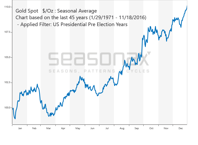
In fact, a whole lot of people are starting to point to the second half of 2015 as a danger zone. For example, just consider the words of David Morgan…
Momentum is one indicator and the money supply. Also, when I made my forecast, there is a big seasonality, and part of it is strict analytical detail and part of it is being in this market for 40 years. I got a pretty good idea of what is going on out there and the feedback I get. . . . I’m in Europe, I’m in Asia, I’m in South America, I’m in Mexico, I’m in Canada; and so, I get a global feel, if you will, for what people are really thinking and really dealing with. It’s like a barometer reading, and I feel there are more and more tensions all the time and less and less solutions. It’s a fundamental take on how fed up people are on a global basis. Based on that, it seems to me as I said in the January issue of the Morgan Report, September is going to be the point where people have had it.Time will tell if Morgan was right.
But without a doubt, lots of economic warning signs are starting to pop up.
One that is particularly troubling is the decline in new orders for consumer goods. This is something that Charles Hugh-Smith pointed out in one of his recent articles…
The financial news is astonishingly rosy: record trade surpluses in China, positive surprises in Europe, the best run of new jobs added to the U.S. economy since the go-go 1990s, and the gift that keeps on giving to consumers everywhere, low oil prices.
So if everything is so fantastic, why are new orders cratering? New orders are a snapshot of future demand, as opposed to current retail sales or orders that have been delivered.
This article first appeared here at the Economic Collapse Blog. Michael Snyder is a writer, speaker and activist who writes and edits his own blogs The American Dream and Economic Collapse Blog. Follow him on Twitter here.
we have been living in.
Saturday, March 7, 2015
Friday, March 6, 2015
What Do These Charts Tell You
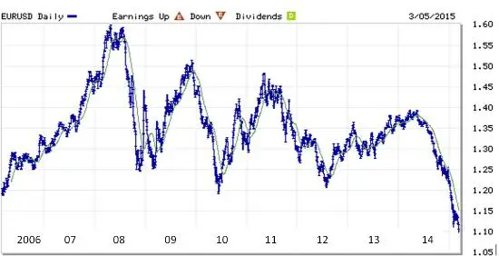
The premise of a currency war is that by devaluing its currency a country is able to sell things overseas more cheaply, which gooses its growth at the expense of its trading partners.
If it actually works that way, then you’d expect this chart of the euro plunging against the dollar…
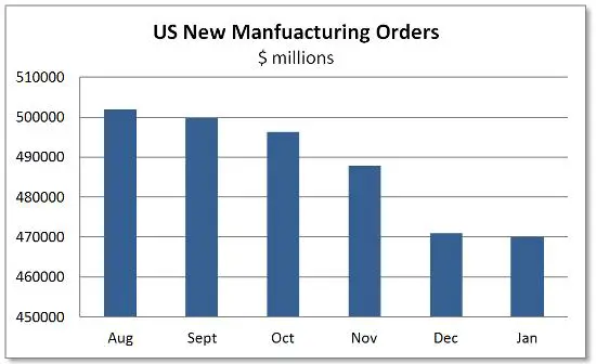
…to be reflected in some sort of strong-dollar related downturn in the US. And right on cue, the Fed reported this morning that American manufacturers are now in the sixth month of a new-orders slowdown:
If things continue to play out according to script the coming year will be slightly better than expected for Europe (but only slightly because of all the other messes those guys have made of their common currency experiment) and quite a bit worse than expected for the US (because we actually think we’re recovering).
Then comes the next and final stage of the cycle, where the US realizes that it’s tipping back into recession, with all the unacceptable things that that implies for the equity bubble, tax revenues and campaign contributions, and shifts gears from tightening to open-the-floodgates loose, hoping to push the dollar back down against the euro, yen and yuan. The difference this time around will be that, as Europe is now discovering, easing monetary policy when interest rates are already zero means pushing into negative numbers. And that means yet another leap of faith into uncharted, experimental, very possibly disastrous territory.
http://dollarcollapse.com/currency-war-2/what-do-these-two-charts-have-in-common/
Subscribe to:
Comments (Atom)


