Last week, I looked at the yield curve as modeled by the spread between the 1-year and 10-year yields on Treasury Notes. That's not the entirety of all maturities on the entire curve, but it does give us a simple graphical representation of what the slope of the yield curve looks like. The two main points of that article were that an inverted yield curve is always bad for the stock market and for the economy, and also to note that just because the yield curve is not inverted, that does not necessarily mean that the stock market is immune to having trouble.
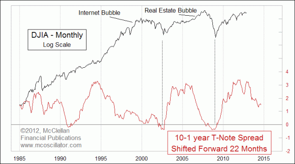
This week's chart gives us a good insight as to why that is. For this week's chart above, I have flipped around the yield spread plot so that we are looking at the 10-year yield minus the 1-year, whereas last week I showed it as the 1-year minus the 10-year. The result is the same, just upside down.
One other adjustment in this week's chart is that I have shifted forward that yield spread by 22 months to reveal that the movements of the DJIA seem to follow in the footsteps of this yield spread model. It is not a perfect fit, just a really good one. . . .
Looking ahead, the flattening of the yield curve during the past 2 years (thanks, Dr. Bernanke!) means that stock prices will be under downward pressure.
No comments:
Post a Comment