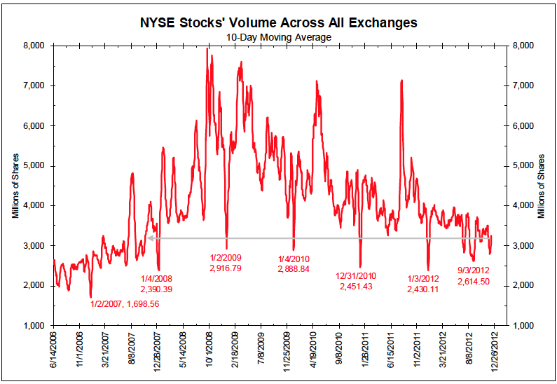
We have been playing a bit of a parlor game around the office, looking at what are the most important charts of the year. An Apple chart was way too obvious, as was a Fed balance sheet or Interest rates. Josh thinks consumer trends, JC prefers spread between Oil and Nat Gas, Bat like CINF.
I want to nominate what may be the most deceptive chart you will see: NYSE Volume. Its deceptive because its simplicity reveals so many things beyond what it is ostensibly covering of mere trading volume.
Consider what the overall falling volume trend means:
• The financial services industry is shrinking;
• Commissions are falling
• Stock picking is being replaced with ETFs;
• Psychology is negative, as Main St is not participating and Mom & Pop have left;
• Active trading is being replaced with passive indexing;
• HFT Algos may spoof millions of phony bids, but they are having a harder time getting executed.
That’s why I nominate NYSE Volume as my chart of the year . . .

No comments:
Post a Comment