There are really good chart patterns … then there are great chart patterns. The Soybean Meal chart story is among the most bullish I have seen in quite some time.
A picture is worth a thousand words. A chart is certainly worth half as many. So I will try to tell a narrative in as few words as possible.
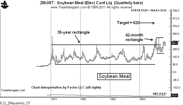
The story in Soybean Meal is to be found on the quarterly graph, as shown below. This graph shows that the advance in early 2008 completed a massive 35-year rectangle. I bet you 5-minute chart traders have never conceived of such a long pattern. This configuration has a target of 620. A point and figure chart would project much higher.

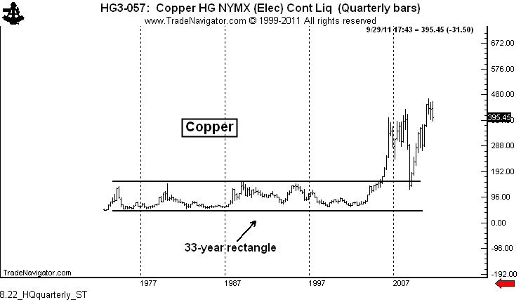
I can recall a similar massive rectangle on the quarterly chart of another market. The market was Copper. See the chart below — and note the outcome. By the way, for all you macro/fundo guys and gals, China has become the world’s largest importer of Soybeans and Soybean products. Sound familiar?
http://peterlbrandt.com/soybean-meal-one-of-this-years-most-bullish-charts/
No comments:
Post a Comment