Total Pageviews

Saturday, August 31, 2013

Boiling Over

A Twitter photo showing a “boiling sea” off the coast of Japan, near the Fukushima nuclear power plant with radiation leaks, has gone viral online.

boiling sea in japan

So, why is the sea ‘boiling’? The answer can be found on theNaturalNews.com report.

“After a 29-month cover-up, the Tokyo Electric Power Co (Tepco) is now calling for international help and has all but admitted Fukushima's radiation leaks are spiraling out of control. In addition to the leaking water storage units that are unleashing hundreds of tons of radioactive water each day, Tepco now says 50% of its contaminated water filtration capability has been taken offline due to corrosion,” the news website published Tuesday.

Friday, August 23, 2013

Crime and Punishment

Ron Paul Says.....


13 1/2 Month Cycle

Chart In Focus

 
August 22, 2013 

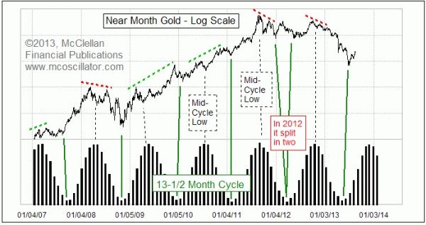
There is a dominant cycle in gold prices lasting about 13-1/2 months, measured bottom to bottom.  But the timing between major lows is not the only message that we can draw from this important cycle.

The latest instance of this cycle's major bottoms was ideally due in May 2013.  It arrived a month late in June, but that is not outside the normal tolerance for punctuality.  With the major cycle bottom evidently in, gold is now in the advancing phase of this cycle, which is when the most robust advances usually take place.  So enjoy it.

Coming up sometime around November 2013, we can reasonably expect the next occurrence of a mid-cycle low, which tends to appear just as the sine wave representation is reaching its cycle top.  In other words, this cycle is really a two-humped or "bactrian" cycle, with two important price highs occurring on either side of the top of the cycle itself.  And within the construction of those two price highs, there exists a lot of information.

If the price action were a perfect sine wave, even with a double hump, then all tops and bottoms would be exactly equal to the others.  But trends exist in the market.  And those trends cause the twin price highs in each cycle to be unequal.

If the left-hand top is higher than the right-hand one, that is a condition known as "left-translation", and it conveys a bearish message for gold prices.  When there is an instance of left-translation, the decline into the major cycle low nearly always exceeds the level of the mid-cycle low.  The 2008 bottom was a perfect example of this.

But when the right-hand top is above the top which precedes the mid-cycle low, then that is called "right-translation", and it carries a bullish message for the future.  It says that the decline into the major cycle low should not be as bad, and should not take out the price level of the mid-cycle low.
In the most recent cycle, the highest price high was before the mid-cycle low, another case of left-translation.  And sure enough, the decline to the major cycle low was much worse than it has been other times.

But now we are into a new cycle, and into the most aggressive advancing phase of this cycle.  Now is the period when the biggest advances in gold prices are usually seen.  We can worry about whether the left peak is above the right peak for this cycle in a few months when that information arrives, but that is not the issue to worry about right now.

Why does this cycle exist?  That is not a question for which I have a good answer.  But I can say that it has been around for a really long time.  Here is a long term flashback chart, showing how this cycle behaved between 1996 and 2008.  And if this chart evidence is not enough to convince someone that there is a real phenomenon there, could that person ever be convinced by any amount of evidence?

Gold's 13-1/2 Month Cycle 1996-2008

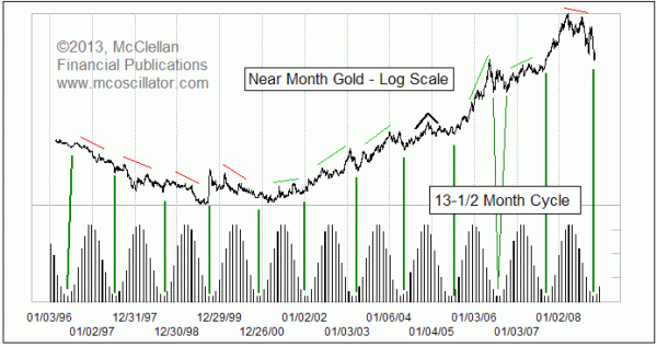
You can see that all during the long bear market in gold during the late 1990s, there was left-translation each time.  When an instance of right-translation finally appeared in 2001, that signaled a huge change in the nature of gold's price behavior.

I mentioned that I don’t know why gold exhibits this very regular 13-1/2 month cycle.  But I do know that there is a very real and important anchor which seems to control its regularity.  You may have noticed that these charts show a rather funny looking representation of a sine wave cycle, with bars instead of a wiggly line.  Those bars have an important meaning: They represent the distance between the earth and moon on the day of the full moon.  So the 13-1/2 month cycle which is evident in gold prices just happens to match up really well with the lunar apogee-perigee cycle.  Or at least it has for a couple of decades, which ought to be long enough to establish it as a real phenomenon.

Why should that matter?  I have no good explanation.  But I learned long ago that worrying about the "why" does not get me very far.  In the words of the late Mike Epstein, a NYSE floor trader who went on to become the president of the Market Technicians Association, and then an adjunct professor at MIT:

This is one of the most important points I've had to learn. For me, at least, "why" Is the most expensive and LEAST VALUABLE information. When you get "why" wrong (and act accordingly) you lose lots of money. You only can know "why" for sure after the fact (when it is useless). You gotta learn to live with the reality that there are (and the market knows) things that are beyond the individual(you)'s ken. The search for "why," whether right or wrong, can just as easily lead you to irrelevancies, or, worse yet, to valid data that will not impact on the market. The best analog is arguing with your wife. Being right is often totally valueless if not counterproductive.

So the point is that worrying about the "why" of gold's relationship with the moon's 13-1/2 month apogee-perigee cycle does not help.  We have enough evidence now after multiple occurrences over a couple of decades to see that it does seem to matter.  And even if we want to ignore the relationship to the moon, we can see that this 13-1/2 month cycle does produce robust rallies in the advancing phase, which is where we are right now.
Tom McClellan
Editor, The McClellan Market Report

http://www.mcoscillator.com/learning_center/weekly_chart/golds_13-1_2_month_cycle/

Tuesday, August 20, 2013

Wal Martians


Seeing eye goat? Or looking for a wedding dress


M&M dispenser? 
(think about it)


Uh, Houston , we have a problem… 


Bride of Michelin Man 


Can you tie em’ in a knot? Or flip over your shoulders 


I
The Kardashians looking for the bargains 


Open for bidnezz 


Assaconda?


OK then 


Drag'm Grandma 


YOU WANT SOME OF THIS...Don't You 


YEHTI IN DRAG? 


Couple of players... Chillin' with a hot babe in the frozen food aisle 


I smell romance 


Checking out the six-pack...oh, sorry it's a full case 


DORA DA Explorer in 70 yrs...check out the tats, one from every country 


Slip sliding away 


Just stopped by after Ballet 


Say it loud ...say it proud 


Shock and awe, anyone? 


Stomach suddenly turning ??...reach for Prevacid 


At his age, you just don't give a hoot anymore 


Rock on, lil' redneck 


Ever wonder where Walmartins sleep? 


Butt… butt… oh, never mind! 


Dang...... Barbie got old! 


OK, so you were an underwear model, but that was 40 years ago! 


Whatever happened to no shoes, no shirt policy? 


Took the words right outta my mouth! WOW what a wedgie 


SCHRUNCHIE TOTEM? 


Predator's Sister goes shopping 


I’m Too Sexy For My Shirt

"My feets is killen me!"...Removal may be a job for the HEAVY URBAN RESCUE TEAM
.

I ALREADY KNOW WHAT THE H.U.R.T. AGENTS ARE GOING TO SAY WHEN THEY SEE THIS...
"HOW THE HELL DID SHE GET IN THERE IN THE FIRST PLACE!"

Breakaway Gap?

There is a common misconception out there that, “gaps are always filled”. We’ve all heard that one right? But the thing is, that there are all different kinds of gaps that all have different implications. Exhaustion Gaps for example are always filled, by definition. They show up at the end of a move, uptrend or downtrend, and then quickly reverse. It was given that name because the market’s move by that point is, “exhausted”. ButBreakaway Gaps aren’t filled for a long time, if ever. They show up to begin a big move. One day the market gaps higher (or lower in a new downtrend) and doesn’t look back. Some might call it a “gap and go”.

Take a look at all of these gap and go’s in the stock market during this uptrend. Nice moves followed those gaps. But this is now the second consecutive time that we’ve seen one to the downside. So if this is indeed a breakaway gap, the implications could be devastating for this market.

We at least know this isn’t an exhaustion gap….

8-19-13 spy gaps

Look at the uptrend line from the November lows. These recent gaps lower came at or around that trendline. So we know the market is recognizing the significance of this well-defined uptrend. Now we’re back below it, after gapping lower.  This critical break also comes right at the horizontal support we’ve been talking about, that represents the May closing highs.

Breakaway gap or not, this is an important series of events that has occurred over the last week. To invalidate the consequences of this potential breakaway gap, S&Ps quickly need to be fill it and the May highs need to be retaken by the bulls.

The Japanese call gaps, “windows”. And when they’re filled, they say the market is “closing the window”. So with that in mind, I think the bulls’ window of opportunity could be closing as we speak.

http://allstarcharts.com/was-that-a-breakaway-gap-in-the-sp500/

Financial Ruin?

Sunday, August 18, 2013

We Need A Hero Like This In America

The man who forced the government of Iceland to resign, and removed the IMF representatives from his country, Hörður Torfason, is now teaching meta-modern democracy throughout Europe. The rest of the world would benefit from following the example set by Iceland: Arresting the corrupt bankers who are responsible for the current economic turmoil.

Iceland’s president explained how his country recovered so quickly from the recession: “The government bailed out the people and imprisoned the banksters — the opposite of what America and the rest of Europe did.”

Friday, August 16, 2013

Can You Blow My Whistle Baby


Apple Analog

Chart In Focus

 
August 15, 2013 

I do not normally like re-runs of a particular story, especially when I just covered it here back in May.  But recent news plus some chart events with the share price of Apple Corp (Nasdaq: AAPL) make it worthy of comment again.
Activist investor Carl Icahn (the guy who once destroyed TWA, etc.) recently made news and spiked AAPL's price upward when he sent out a message on Twitter, stating that he had bought into the company and also had spoken with CEO Tim Cook about increasing share buybacks.

Later, Icahn joked that "My Twitter keypunch guy at @Carl_C_Icahn messed up..I said I bought a BUNCH OF APPLES to the twerp not $1b in $AAPL"

I don't know if the SEC is laughing or not about this pretty blatant effort by Icahn to "talk his book", or in other words to seek higher share prices by promoting that he had bought in.
And now we find out from actual SEC filings that George Soros is reportedly also piling in.

So is all of this a sign that AAPL really is breaking out of a big bottoming structure, and heading higher now that "strong hands" are buying its shares?  Perhaps, but we should also consider the chart above, which still appears to be working.  I introduced this comparison last year, showing how the movements of AAPL's share price in 2012 looked a lot like those of one-time tech darling Microsoft (MSFT) back in the era of the Internet Bubble's peak in 2000.  And since introducing this comparison, it has continued to "work", for the most part.

By that I mean AAPL's price pattern has matched nearly all of the turns seen in the MSFT pattern.  There was one notable exception, as highlighted in that chart.  MSFT got knocked down in April 1999 on news of a Justice Department action in the antitrust case against Microsoft.  AAPL chart plot did not match that one dance step, but otherwise has matched each of MSFT's major chart turns.

Interestingly, the magnitudes of AAPL's moves have not always worked out the same as what MSFT's prior pattern suggested.  But the timing of the turns has been generally right.
And that's all the more relevant now, as we watch AAPL's share price break out to a 6-month high, on the news of all the big guys eyeing AAPL's cash hoard and getting active in owning its shares.  The MSFT pattern has been saying that a run up to a top is due right about now, but that another down leg is ahead.

Here's a closer look at that same pattern analog:

closer comparison of AAPL and MSFT chart patterns
This closer look reveals that there is a little bit of "accordioning" of the exact timing of the matching turns.  But each of the dance steps does get repeated roughly on time, or at least they have up until now.  So does that mean we are guaranteed to get the upcoming price drop repeated in AAPL.

Absolutely not.  There are no guarantees.

But as we contemplate how this pattern analog fits with all the news stories about the big guys playing around with AAPL shares, it is important to understand that such stories often appear right as prices are topping.  One famous example was a big top in silver prices back in 1997, a top which developed just a few days after Warren Buffett had revealed that he had taken a big position in silver futures.  The crowd rushed in when they heard that Buffett had been a buyer.  Those stories did not say whether Buffett still held those positions.

Trying to bet on a decline in AAPL right now, while the big guys are still having their effect on pulling in the crowd, is the upside-down equivalent of catching a falling knife.  It can be dangerous.  And it is even possible that this is the point when this pattern analog is going to break correlation, as all of them eventually do.

But the MSFT pattern should be a useful one for traders to keep in mind in case we do see a blowoff top and reversal in AAPL's share price.  It says that a better entry point for investors is due in September 2013, rather than at a point of maximum excitement in the stock like we are witnessing right now.

And here is one additional point to consider.  This final chart is the one which first got me looking at AAPL now versus MSFT in 2000.  With the help from the nice folks at Global Financial Datawww.globalfinancialdata.com, I created this comparison to RCA back in November 2012, just after AAPL had its top at $705/share.

AAPL versus RCA
The point of that comparison was that RCA (Radio Corporation of America) had been the tech darling of the 1920s, the stock that "everyone" wanted to own.  And AAPL has arguably been the tech darling of the 2010s based on the success of its phone and other products.  The comparison is not between the companies themselves, but rather between their price patterns.  It relates to the way that investors fall into and out of love with tech stocks.  The actions of investors are what create the patterns in the share price, and so seeing similar patterns suggests that investors are going through the same stages of falling out of love with AAPL that they went through with MSFT in 2001, and RCA in 1930.  Whether AAPL does a complete unwind like RCA did in the 1930s remains to be seen, but it's looking good so far.

http://www.mcoscillator.com/learning_center/weekly_chart/corporate_raiders_make_a_run_at_apple/