
Tuesday, July 31, 2012


Strangest Indicator Ever?
It turns out that what we throw out or, more accurately, how much we throw out, tells us a lot about the general economic direction of the country.
At least, that is, according to calculations by economist Michael McDonough, who has produced an absolutely fascinating chart that shows the remarkable correlation between carloads of waste (as calculated by the American Association of Railroads) and the U.S. gross domestic product.

If
McDonough’s chart is right — and an 82 percent correlation between trash and the GDP is nothing to toss out — it bodes poorly for the GDP.
McDonough’s chart is right — and an 82 percent correlation between trash and the GDP is nothing to toss out — it bodes poorly for the GDP.
There’s already some indication of continued economic sluggishness; from April through June the economy grew at an annual rate of 1.5 percent — below the 1.8 percent GDP growth in 2011.
Given that the economy — and whether voters believe President Obama or former Massachusetts governor Mitt Romney is better equipped to make it better — will almost certainly decide the November election, any indicator suggesting the direction we are headed on that front is useful.
And you thought garbage was just, well, garbage.
Monday, July 30, 2012

History Says This Cannot Last Forever
The spin and MOPE cannot change the following reality:

After "Rise of China" the big banks have created 700 trillion US dollar unregulated financial betting’s (OTC (Over The Counter) derivatives). The main part is interest bettings (in order to reduce the interest rates so governments and banks do not go broke), and they have put long interest rates in US, Germany and Japan to unrealistic and uneconomical levels. The OTC derivatives are under water and cannot be settled without the big banks all over the world are going broke.
Capital flight from countries in distress is funding creditor states at zero rates. “This can’t go on for long".

Sunday, July 29, 2012
Friday, July 27, 2012
Thursday, July 26, 2012


Wednesday, July 25, 2012
HINDENBURG OMEN

The Hindenburg omen triggered with the sharp decline on Monday. First, notice that new highs and news lows as a percentage of total issues surged above 2.8%. Second, notice that new highs were less twice the number of new lows. And finally, the NY Composite ($NYA) was above its 50-day moving average on Monday.
Click this image for a live chart
http://blogs.stockcharts.com/dont_ignore_this_chart/2012/07/hindenburg-omen-triggers-as-new-lows-surge-nyhl-nahl-nya.html#.UBAH0WHwsqM
Tuesday, July 24, 2012
This Would Be Way Cool
The Spruce Whale
A futuristic flying marvel the likes of which have never been seen! The WB-1010 is a concept plane made to make use of yet-to-be-invented materials and technology and aims to meet the demands the world 85 years from now will make. Speed, comfort, and space for a whole lot of people, that’s what this is all about. You’re in for a real treat of shocking and splendidly fantastic conceptual technology in one notorious BIG future plane!
The WB-1010 (stands for Wright Brothers) is an official entry into the current KLM Indonesia aircraft design competition. It’s purely a concept plane using technology that might be feasible in the future, but right now lies in the mind of the inventor. You know what that means! Conceptual Facts time!
It can seat more than 1500 people!
It can reach speeds of nearly 1000 kmph!
It’s made of materials similar to GLARE (“GLAss-REinforced” Fibre Metal Laminate (FML)), composed of several very thin layers of metal (usually aluminium) interspersed with layers of glass-fibre “pre-preg”, bonded together with a matrix such as epoxy. — thank you WIKI — similar to that used on the Airbus A380 (another gigantic plane I bet you might be aware of already)!
It has helium injected in the body to make the plane lighter!
It’s windows are made of “Smart Glass!”
It will be able to harvest wind energy in flight!
It has a super jet that will allow the plane to land on a normal runway or completely vertically!
Amazing super fantastic!
*Special BONUS actual real facts that have already happened in the past: the original “Spruce Goose” (Hughes H-4 Hercules, completed 1947) was built almost entirely of laminated birch, not spruce as its nickname suggests and at the time of this post STILL has the largest wingspan and height of any aircraft in history
Designer: Reindy Allendra


Read more at http://www.yankodesign.com/2009/10/14/the-spruce-whale/#pLCeRvV5Mz4HQuEF.99
Good Info

Here are six things you need to know about body language.
1. Most people overestimate their energy level.
When I conclude a mock interview during our media training workshops, I ask the trainee to rate on a 10-scale how much energy she thought she had during the interview.
“Oh, around a seven or eight,” she’ll usually guess.
I then ask the other people in the room to rate their colleagues’ energy. They usually rate it a four or five. Turns out, we’re lousy judges of how energetic we appear to others, and most people benefit from boosting their energy level 10 to 15 percent.
2. Stop thinking and look at me.
When we speak, we maintain eye contact just 40 to 60 percent of the time. That’s because we’re busy trying to access information from our brains—depending on the type of information we’re trying to retrieve, we look to up to the left, up to the right, or down.
But in the context of a media interview or speech, that lack of eye contact can signal nervousness or evasiveness. You can help maintain better eye contact if you pause briefly before answering a question, which will allow you to access the information you need before you begin speaking.
3. Gesturing makes your words better.
Whenever we encourage spokespersons to incorporate gestures into their deliveries, we consistently find that their words get better.
The physical act of gesturing helps them form clearer thoughts and speak in tighter sentences with more declarative language.
So, the next time you give a speech or interview (or speak with your boss or a client), gesture as naturally as you typically would in everyday life. Your words will come to you more easily—and the words you use will be stronger.
4. When you’re defensive, you remember less.
Allan and Barbara Pease, authors of “The Definitive Book of Body Language,” report a fascinating finding from one of their studies.
When a group of volunteers attended a lecture and sat with unfolded arms and legs, they remembered 38 percent more than a group that attended the same lecture and sat with folded arms and legs.
If you see your audience exhibiting defensive body language, change tactics—and don’t try to persuade them to your point-of-view until their body language opens up.
5. Your feet point the way.
Your feet subconsciously tell you where you want to go.
Next time you’re in the middle of a conversation you wish you could exit, look at your feet. You might be surprised to find that they’re not both pointing directly at the person with whom you’re speaking.
The same is true for other people. So, if you’re not sure whether the person you’re speaking with is truly interested in your conversation, just look at his feet.
6. If you smile, they smile.
We subconsciously imitate the things we see. When I look at someone and smile, they tend to smile. When I look at someone and nod, they tend to nod.
Some neuroscientists say that type of mirroring behavior is due to “mirror neurons.” That’s important information, because audiences that are smiling and nodding are more receptive to your ideas. So, smile and nod at appropriate moments, and you’ll be that much closer to accomplishing your goals.
Visit the Mr. Media Training Blog to see the 21 Most Essential Media Training Links. Brad Phillips is the author of the Mr. Media Training Blog and president of Phillips Media Relations, which specializes in media and presentation training.

Ugliest Chart Contest
Here’s a couple fugly charts from the major equity indices that we track. The ugliest are China related such as its de facto suppliers — Japan, Korea, and Brazil.
Let’s start with S&P500 – a relatively good looking chart – for a comparison. The index has been zigzagging off its short-term uptrend line making higher highs and higher lows since bottoming in June. It feels the world wants large cap U.S. stocks and this is where the global allocation is taking place. Currently at uptrend support the S&P needs to hold the 50-day at 1333, which it did today bouncing off 1337. A close below 1325 “breaks the mirror.”
 The Russell 2000 broke its uptrend and made a lower low today. Though it closed above the 50-day, we now view this chart as damaged goods. Note the Russell is a fave hedging vehicle of the
  The CAC 40 looks like a classic double top. ‘Nuff said.
 The Nikkei broke the neckline of its head and shoulders formation and a test of the June 4th 8230 low looks to be in the works.
 The Kospi needs to hold support at 1774 or a test of last September’s low of 1644 is likely.
 The Brazilian BOVESPA is the worst YTD performer on our watch list. The index made a new 2012 low today. Let’s see if the BOVESPA can bounce on the stronger than expected PMI data from China.
 The Shanghai Composite wins the ugly chart contest. The index is down almost 40 percent from its August 2009 post-crash peak and remains in an ugly downtrend. A break of the January 2012 low of 2132 could get ugly.
 (click here if charts are not observable)
Monday, July 23, 2012
Inflation?...nahhhh
Overall, "inflation" describes a period when most prices (and wages, interest rates, and home prices) are rising, and I don't think we're anywhere close to meeting those conditions yet. Certainly not as long as so many prices for food, energy and household items are declining or staying the same, and not rising. Any notion that "real" inflation is now running about 8-10% at an annual rate according to some adjusted "real" measure of consumer prices seems to be very misguided, and not supported by the actual price data presented above for many food and energy items.
% Change Last Year | |
|---|---|
| Food (actual prices) | |
| Butter | -14.5% |
| Lettuce | -13.2% |
| Bacon | -10.9% |
| Rice | -9.6% |
| Cabbage | -9.2% |
| Ham | -7.2% |
| Milk | -6.2% |
| Bread | -5.8% |
| Broccoli | -4.5% |
| Tomatoes | -4.3% |
| Bologna | -3.0% |
| Peppers | -3.0% |
| Chuck Roast | -2.7% |
| Malt Beverages | -2.7% |
| Flour | -1.7% |
| Turkey | -1.5% |
| Bananas | -1.5% |
| Potatoes | -1.3% |
| Eggs | -0.8% |
| Energy | |
| Natural Gas | -13.6% |
| Fuel Oil | -8.1% |
| Gasoline | -4.1% |
| CPI: Household Items | |
| Televisions | -19.5% |
| Computers | -8.1% |
| Leased Cars | -6.5% |
| Toys | -5.5% |
| Computer Software | -4.3% |
| Photographic Equipment | -4.2% |
| Sports Equipment | -1.4% |
| Wireless Phone Services | -0.6% |
http://mjperry.blogspot.com/2012/07/for-many-items-prices-are-falling-not.html
Sunday, July 22, 2012
Buckle Up
It was just about a year ago today when the S&P was sitting at fresh highs and everyone was enjoying a rather upbeat summer. It was a nice summer, the markets were calm, and there was a surreal sense of optimism. Then, in the matter of a few days, things got real ugly, real quickly.
Well, it doesn’t seem like too much has changed since then. We’ve had mixed earnings reports, ever-evolving worries in Europe, and the always looming fiscal mess in the U.S. Once again, are we in the calm before the storm?
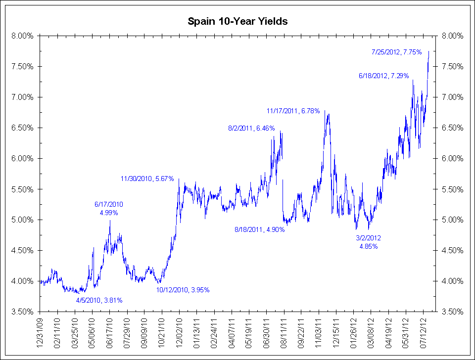
It looks like things in Europe may start to heat up again. Riots turned violent again in Spain as protestors took to the street over austerity measures. With seemingly no resolution, a sinking tourism industry in the PIGS, and a typically hot summer August on its way, all signs point to further turmoil.
Technically, we’re currently seeing a number of bearish indicators setting up in the S&P and other markets. First, on the weekly chart of the SP500 Futures we can see what appears to be a bear flag formation developing. Note the recent rise in price since the beginning of June on decreasing volume.
Weekly SP500 Futures Chart Patterns
 Chart Pattern Trading
Daily Chart Elliott Wave Count For SP500
A second look at the S&P daily illustrates a down trend and 5 wave count bounce in the market, both are currently pointing to lower prices.
Completion of two intermediate cycles within longer term 5 wave pattern- Downwards wave one from April until beginning of June followed by wave 2 correction from June until present.
The wave two correction typically proceeds the longest wave, wave three, which is pointing towards a large move down (Note that in the first shorter term cycle the downwards wave three was the longest by far. We expect the same to be repeated in the longer term cycle.)
 Elliott Wave Theory Chart Pattern Trading
SP500 BIG PICTURE Wave Count
A look at the longer term view once again using the weekly chart, again supports our argument for a major correction. We have just completed a 5 wave pattern since the 2009 lows, and it is looking more like a big pull back is due. Remember most major trends end after the fifth wave.
 Stock Market Elliott Wave Count Chart Pattern Trading
Copper Weekly Chart Patterns
If we take a look at the copper ETF, “JJC”, we are provided with further justification. Copper is often referred to as “Dr.Copper” due to its industrial application and is known to be a leading indicator for equity markets. Copper has significantly underperformed equity markets and is likely leading the next move down. A look at the weekly chart which points to a rather dismal outlook. There is a major head and shoulder patterns developing.

Copper Chart Pattern Trading
Major Market Pattern Analysis Conclusion:
Last summer turn into a bloodbath with nothing but red candlesticks taking stocks and commodities sharply lower. If you haven’t already, it’s time to lock in some profits. Short, intermediate, and long term cycles are pointing down, and the increasingly bearish technical developments cannot be ignored. We’ll be looking at entering multiple shorts potentially in the very near future once/if setups present themselves. Buckle up and stay tune for more…
http://www.themarketguardian.com/2012/07/put-your-seatbelts-on-its-about-to-get-bumpy/
http://www.themarketguardian.com/2012/07/put-your-seatbelts-on-its-about-to-get-bumpy/
Saturday, July 21, 2012
Lopsided Euro Trade Make Me Think...Watch Out
Even though futures trading represents only a small component of the overall currency market (most currency transactions are over the counter), the CFTC Commitment of Traders Report gives a good indication of speculative position buildup. And as before, the short euro trade continues to be the bet of choice.
Clearly the fundamentals are in favor of betting against the euro. But one has to be careful of the technicals, as the reversal of this trade could become quite violent.
http://soberlook.com/2012/07/bets-against-euro-still-popular-trade.html
GS: - EUR net shorts rose yet again to -$25.7 bn from -$25.4 bn last week and our positioning score moved from -9.1 last week to -9.2 this week, indicating slightly larger EUR net shorts once adjusting for open interest and the rate differential.The Goldman's positioning score is an indicator of how "crowded" this trade is.
 |
| Source: GS |
Clearly the fundamentals are in favor of betting against the euro. But one has to be careful of the technicals, as the reversal of this trade could become quite violent.
http://soberlook.com/2012/07/bets-against-euro-still-popular-trade.html
Corn Target?
The Midwest growing area of the U.S. is locked in drought that is reducing potential crop yields daily. The current crop is stressed — and we are fast approach the time when yields could drop sharply without soaking rain storms.
If the current bull market continues, the question becomes, “How high is high?” The charts may offer a clue. This is not a prediction but simply a possibility.
The quarterly Corn chart is poised to make a new all-time high. The chart displays a possible 4-year ascending triangle. This pattern would establish a target of $12.50 if decisively completed by a Friday close. . . .

GE is speaking... Does it matter?
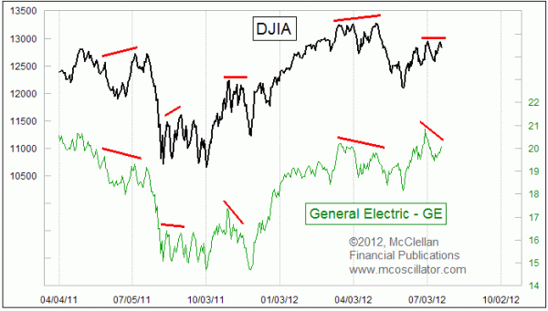
The term "bellwether" comes from an old middle English word bellewether, which referred to the sheep herding practice of hanging a bell around the neck of a castrated ram (a wether) who would act as a leader of a flock of sheep. You could tell where the flock was by listening for the bell.
It gets used when people talk about the stock market in reference to certain stocks or indicators that can tell us about what the overall market is doing, or better yet what it is going to do.
My late friend Larry Katz introduced me to the idea portrayed in this week's chart, which is to compare the movements of the DJIA to the price plot of General Electric (NYSE:GE). GE is a component of the DJIA, so it understandably has a strong positive correlation to the behavior of the DJIA itself. That is not news, and indeed the correlation itself is not very interesting. It is when we see a difference in behavior that there is useful information.
Larry pointed out years ago that when GE and the DJIA disagree, one should listen to GE. This is especially true at tops. GE's share price was up on Friday, July 20, when it released its quarterly earnings report, showing that revenues were up. But GE's share price is still well below the high that it made back on June 29. That is interesting because the DJIA was able to equal its own prior high, and the SP500 was even able to make a slightly higher closing high.
The divergences highlighted in this chart illustrate how GE is worth listening to when it fails to confirm a higher high for the DJIA. The duration of that message is typically fairly short, calling for a swoon lasting for only up to a few weeks. And once a corrective move does appear in each of these, then the slate is wiped clean and they can start upward again. In other words, once the weakness appears that GE's share price was warning about, then the warning has been fulfilled and it expires.
Readers of our twice monthly McClellan Market Report and Daily Edition know that the eurodollar COT leading indication has been calling for a correction in July. So now that we have GE's share price adding its own note of caution, it appears even more likely that a brief swoon is about to unfold.
Tom McClellan
Editor, The McClellan Market Report
http://www.mcoscillator.com/learning_center/weekly_chart/ges_share_price_has_message_for_market/
Friday, July 20, 2012
DOJI
After a four day surge that carried the Dow Industrials SPDR (DIA) above 129, the ETF formed a doji to signal indecision on Thursday. Also notice that DIA formed indecisive candlesticks at the prior two peaks. A gap down and long black candlestick on Friday would form a rare evening doji star.

Click this image for a live chart
Click this image for a live chart
Complacency In VIX is Worrisome
Take a look at this chart of the VIX index (the S&P500 implied volatility index). This is not your standard "stochastic" process . In the last 5 years the index has maintained a definite floor somewhere around 15. VIX is currently at 15.45. Risk pricing in US equities is once again showing lack of caution. . . .
http://soberlook.com/2012/07/vix-near-lows-shows-mispricing-of.html
Yesterday's new high wiped out that potential head and shoulders top that I was worried about, but the steady loss of momentum over the last 5 weeks combined with the complacency make this look like a market that could tank on short notice with very little provocation.
 |
| VIX |
Yesterday's new high wiped out that potential head and shoulders top that I was worried about, but the steady loss of momentum over the last 5 weeks combined with the complacency make this look like a market that could tank on short notice with very little provocation.
Thursday, July 19, 2012


Nat Gas About To Pop

Nat gas (UNG) has recently caught my attention. While it was in a significant downtrend for the better part of a year it has recently been consolidating right under the $20 level. A look at the daily chart shows a long move down and then recently a sideways consolidation pattern. While this is typically a continuation pattern I am beginning to believe think that the next move may be up rather than an extension of the previous down trend.
- Over the last two weeks there been significant support above $18 and significant volume.
- The $20/$20.50 level has been tested multiple times and the more tests it undertakes the more likely it is to break.
- Both the 20-day and 50-day moving averages have turned upwards and UNG is trading above both
Wednesday, July 18, 2012

Mind Test
OOOOOOOOOOOOOOOOOOOOOOOOOOOOOOO OOOOOOOOOOOOOOOOOOOOOOOOOOOOOOO OOOOOOOOOOOOOOOOOOOOOOOOOOOOOOO OOOOOOOOOOOOOOOOOOOOOOOOOOOOOOO OOOOOOOOOOOOOOOOOOOOOOOOOOOOOOO OOOOOOOOOOOOOOOOOOOOOOOOOOOOOOO OOOOOOOOOOOOOOOOOOOCOOOOOOOOOOO OOOOOOOOOOOOOOOOOOOOOOOOOOOOOOO OOOOOOOOOOOOOOOOOOOOOOOOOOOOOOO OOOOOOOOOOOOOOOOOOOOOOOOOOOOOOO OOOOOOOOOOOOOOOOOOOOOOOOOOOOOOO 2 - If you already found the C, now find the 6 below. 99999999999999999999999999999999999999999999999 99999999999999999999999999999999999999999999999 99999999999999999999999999999999999999999999999 69999999999999999999999999999999999999999999999 99999999999999999999999999999999999999999999999 99999999999999999999999999999999999999999999999 3 - Now find the N below. It's a little more difficult. MMMMMMMMMMMMMMMMMMMMMMMMMMMMNMM MMMMMMMMMMMMMMMMMMMMMMMMMMMMMMM MMMMMMMMMMMMMMMMMMMMMMMMMMMMMMM MMMMMMMMMMMMMMMMMMMMMMMMMMMMMMM MMMMMMMMMMMMMMMMMMMMMMMMMMMMMMM This is NOT a joke. If you were able to pass these three tests, you can cancel your annual visit to your neurologist. Your brain is great and you're far from having a close relationship with Mr Alzheimer. 4 - Eonvrye whocan raed this rsaie your hnad. To my 'selected' strange-minded friends: If you can read the following paragraph, forward it on to your friends and the person that sent it to you with 'yes' in the subject line... Only great minds can read this This is weird, but interesting! If you can raed this, you have a sgtrane mnid too 5 - Can you raed this? I cdnuolt blveiee that I cluod aulaclty uesdnatnrd what I was rdanieg. The phaonmneal pweor of the hmuan mnid, aoccdrnig to a rscheearch at Cmabrigde Uinervtisy, it dseno't mtaetr in what oerdr the ltteres in a word are, the olny iproamtnt tihng is that the frsit and last ltteer be in the rghit pclae. The rset can be a taotl mses and you can still raed it whotuit a pboerlm. This is bcuseae the huamn mnid deos not raed ervey lteter by istlef, but the word as a wlohe. Azanmig huh? Yaeh and I awlyas tghuhot slpeling was ipmorantt! If you can raed this forwrad it |
Ultimate Death Cross!!!!!!!!!!
James Ross, the University Architect at UNC Wilmington and an astute observer of the economy, called my attention to an amusing Business Insider piece published yesterday: The S&P Is On The Verge Of The Ultimate Death Cross. The piece mentions a note published Monday by Societe Generale analyst Albert Edwards, who points out that the S&P is on the verge of an "ultimate" death cross. And what, pray tell, is that? A 50-200 moving average crossover, based on months, not days (or even weeks).
So let's check this out. The S&P 500 only dates back to March 1957. Since that time the 50-month MA has never crossed below the 200 month MA. The closest it came was the June 1978 monthly close, which gave us a 2.09 point spread between the 50-month (92.09) and the 200-month (90.00). During the 55-plus years that the S&P 500 has existed, there has never been an "Ultimate" Death Cross.
At the end of last month, the spread was a little over 11 points.

How disastrous would a trip to the "Death Zone" be? Let's look further back in time. The chart below uses the S&P Composite data set popularized by Yale professor Robert Shiller. It consists of the monthly averages of daily closes since 1871 -- over 140 years of US market history.

Read more: http://www.businessinsider.com/and-now-for-something-completely-different-the-ultimate-death-cross-2012-7#ixzz20yMZdBk8
Interesting
Let’s take a look at the spread between the yield on the 10-year Treasury and the 2-year Treasury — or you if want to sound cool, “2s10s.”
It’s hard to find good indicators that tell us when a recession is coming ahead of time. There are several metrics that perk up when a downturn is near, but they can often give out false alarms. The stock market is perhaps the best example. One of the better indicators is the 2/10 spread. Notice how the spread has gone negative just before the start of the last three recessions.

With the Fed keeping rates near 0%, this metric may have lost its effectiveness. I don’t know for sure. But in deference to its track record, we should note that the spread is still a long way from the danger zone, even though the 10-year yield is at record lows.
Eighteen months ago, the 2/10 spread was over 290 basis points — the highest since at least 1976. As recently as four months ago, it was at 200 basis points. Now the spread is under 130 basis points. In other words, the spread is quickly closing.
Subscribe to:
Posts (Atom)